Lyric Video Fonts: How to Pick Type That Reads on a Phone
Fonts for lyric videos: matching type to genre, size and contrast for phones, how many fonts to use, free commercial fonts, and common mistakes.
The font is the most visible design choice in a lyric video. It's on screen for the whole song. It sets the mood before a single word has registered. And it's the thing people get wrong most often, usually by picking something that looked great in a font preview and is unreadable at the size and speed a lyric video actually plays.
Here's how I think about it.
Readability beats personality
A lyric video has one job: let people read the words while the song plays. Every font choice should be tested against that.
That's harder than it sounds, because lyrics are moving. A line might be on screen for two seconds. A word in a kinetic style might be on screen for half a second. The viewer doesn't get to study the letters. They glance, read, and look away. Decorative fonts that work on a poster (thin scripts, distressed grunge type, very condensed display faces) can turn into noise at that speed.
My rule: if you can't read a line at a glance on your phone at arm's length, the font is wrong for this video, however good it looks.
Match the font to the song
That said, the font should feel like the song. A rough guide that I find holds up:
- Pop and dance: clean, heavy sans-serifs. Bold geometric or grotesque type reads instantly and carries energy. Think of fonts in the family of Montserrat or Inter at a heavy weight.
- Hip-hop and rap: condensed, heavy, often all caps. Impact-style display faces like Anton or Bebas Neue fit lots of words in a line and look loud. Watch the letter spacing, since tight condensed type can blur together on fast verses.
- Rock and metal: heavier, more aggressive type is fine, but resist the urge to go full blackletter for the lyrics. Save the extreme font for the title card and keep the lyrics readable.
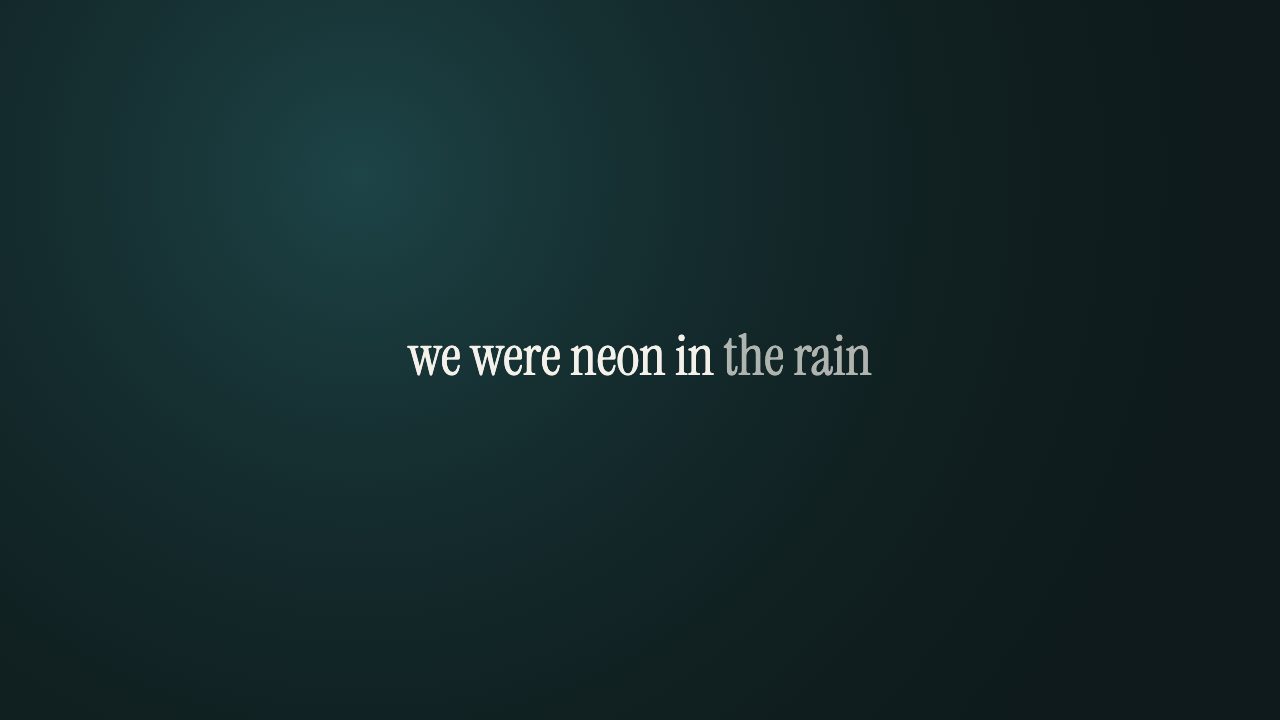
- Ballads, acoustic, singer-songwriter: a good serif or a light, open sans. Serifs like Playfair Display or Lora feel warm and personal.
- Worship: clean, calm, very readable. Congregations sing along to these, sometimes off a screen in a room. Plain sans-serifs, generous size, high contrast. Nothing fancy.
- Lo-fi, indie, bedroom pop: this is where handwritten or typewriter-style fonts can work, as long as the song is slow enough to read them.
Size and contrast for small screens
Most of your views will be on a phone. Design for that, then check it looks fine on a laptop, not the other way round.
Bigger than you think. If the text looks slightly too big on your monitor, it's probably right on a phone.
Contrast first. White or near-white text on a dark or darkened background is the safe default. Bright backgrounds behind white text are the most common readability failure I see. If you're using footage, darken it or pick calmer clips. A soft shadow behind the text helps a lot with busy video.
Mind the vertical format. In 9:16, lines get narrower, so a long line wraps into two or three. Big type plus a narrow frame means more wrapping. Shorter lines help more than a smaller font does.
Keep text out of the edges. On TikTok, Reels and Shorts, the app's own buttons and captions cover parts of the screen, especially the bottom and right side. Keep lyrics around the middle.
How many fonts?
One, maybe two.
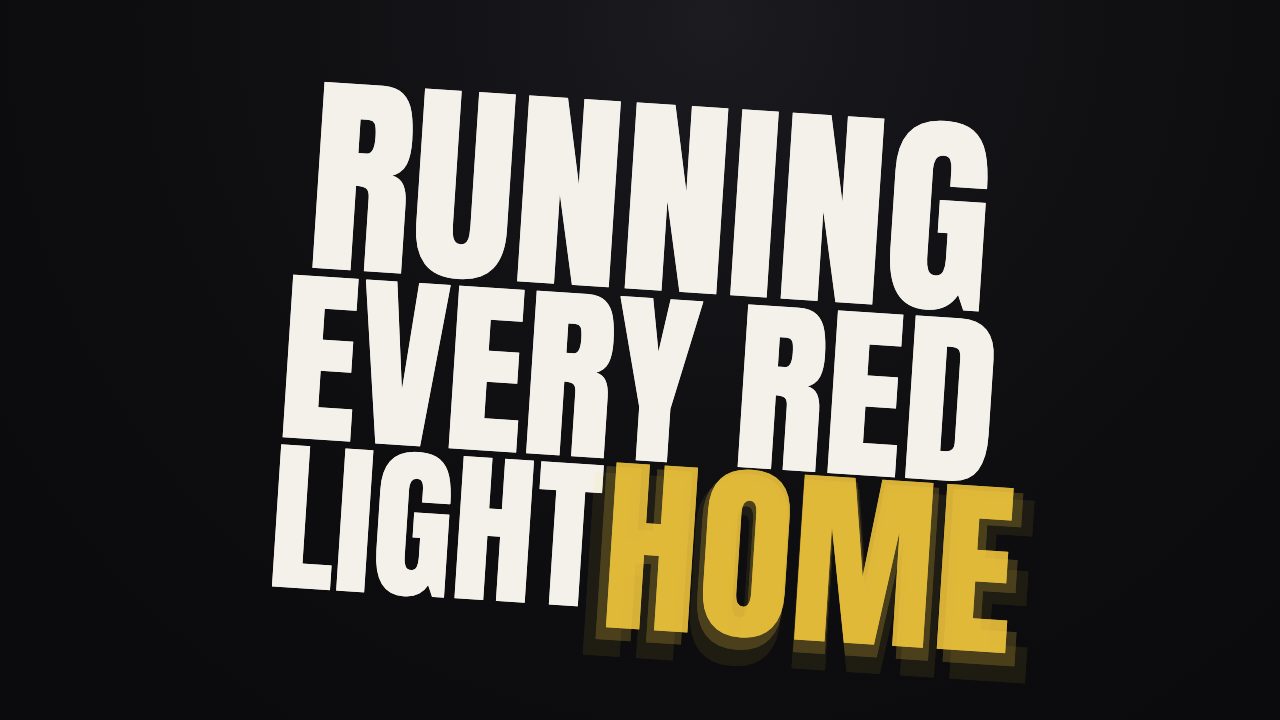
One font for the lyrics. Optionally a second for the song title or artist name at the start. Using a different font per section, or mixing three or four families, almost always looks messy. If you want variety, use one family and change the weight: bold for the chorus, regular for verses.
Animation changes what works
The way words animate in affects which fonts hold up.
- Pop and rise: words appear quickly, so you need type that's readable from the first frame. Heavy sans-serifs are safest.
- Glow: works beautifully with thin, airy fonts on slow songs, because the glow gives thin strokes some body.
- Typewriter: monospaced or typewriter-style fonts look natural here, for obvious reasons. Proportional fonts work too.
- Karaoke fill: you need a font with enough weight that the fill color is clearly visible inside the letters. Very thin fonts make the fill hard to see.
Using fonts legally
If you monetize the video, the font's license matters, because using a font in a video you earn money from is commercial use.
Google Fonts is the easy answer. Google's own FAQ says its fonts are open source and free, and can be used commercially, including in products you sell. Most are under the SIL Open Font License; some use the Apache or Ubuntu Font License. Under the OFL, you can't sell the font files themselves, but videos and designs made with the font aren't restricted by it.
Fonts from random "free font" sites are a different story. Many are free for personal use only. Check the license file before you use one in a video you plan to monetize.
How fonts work in our tool
In our lyric video maker the type is part of the style. You pick Karaoke, Kinetic, Minimal or Stack, and the fonts come set up for that style, sized and spaced to read well in each shape (16:9, 9:16 or 1:1). So you choose a look rather than scrolling through hundreds of typefaces. The four styles roughly map to the genre advice above: Kinetic for loud and rhythmic, Minimal for calm and personal, Karaoke for singalongs, Stack for verses that tell a story.
If you need a very specific typeface for your brand, a general video editor gives you that control at the cost of building the timing yourself. The comparison of lyric video makers covers that trade-off.
Common font mistakes
- Script fonts on fast songs. Unreadable.
- All caps on long lines. Slower to read than mixed case. Fine for short, punchy lines.
- Thin fonts on video backgrounds. They disappear.
- Tiny text to avoid wrapping. Shorten the line instead.
- A different font for every section. Pick one.
For the rest of the process, from audio to export, see how to make a lyric video.