Lyric Video Templates: What You Get and Which to Pick
What a lyric video template really is in After Effects, Canva or CapCut, what each costs you in time, and how our four styles work as ready-made looks.
When someone asks me for a lyric video template, they usually mean one of three different things, and the three save you very different amounts of work. So before the list of looks, it helps to sort out which kind you're after.
Three things people call a template
A project file for a video editor. This is the classic meaning. You buy or download an After Effects project, open it, and find a finished design with placeholder text layers. The look is done for you. The timing isn't. You still have to type every line into its own layer and slide it to the right spot on the waveform. For a three-minute song that's an evening's work, longer if the template animates individual words, because then every word needs its own keyframe. You also need the editor itself and a computer that can run it.
A design template in Canva or a similar tool. Same idea, lighter tools. You get a layout, a font pairing and a few animated text presets. Canva is great at the look. The sync is still on you: you're placing text against audio by hand in a tool that was built mostly for slides and social graphics.
A CapCut template. These are the ones that show up on TikTok with a "use template" button. You swap in your clips and the template does the cuts and effects. They're built around someone else's audio and timing, so a template made for a trending sound won't line up with your song. Some are also marked Pro. CapCut's own help pages say Pro templates and assets can add a watermark to free exports, and that a default ending clip with the CapCut logo can sneak in too. Check for both before you export.
What all three have in common: the template gives you the look, and you supply the timing. Timing is the slow part of a lyric video, so a template that skips it saves you less time than you'd think.
How our styles work as templates
Our tool flips that around. It does the timing first: the vocals are separated, an AI model writes down every word with its start and end time, and if you paste your lyrics it lines your text up with what it heard. Then you pick a look. Change the look and the timing stays put, so you can try every combination on your real song in a couple of minutes.
A "template" here is three settings:
- Style: Karaoke, Kinetic, Minimal or Stack. This is the big one.
- Word animation: Rise, Pop, Glow, Type or None. How each word arrives when it's sung.
- Shape: 16:9 for YouTube, 9:16 for TikTok, Reels and Shorts, or 1:1 for a square post.
On top of those you choose one of four highlight colours, where the text sits (top, middle or bottom), a background (a dark preset, your own image, or, in HD exports, stock footage the tool picks from the lyrics), beat sync if the song has a clear beat, and an optional title card.
One thing to know up front, because the settings panel shows every option for every style: not every style uses every setting. I'll say which ones below. You can browse all of them with example genres on the styles page.
Karaoke: when people need to sing along
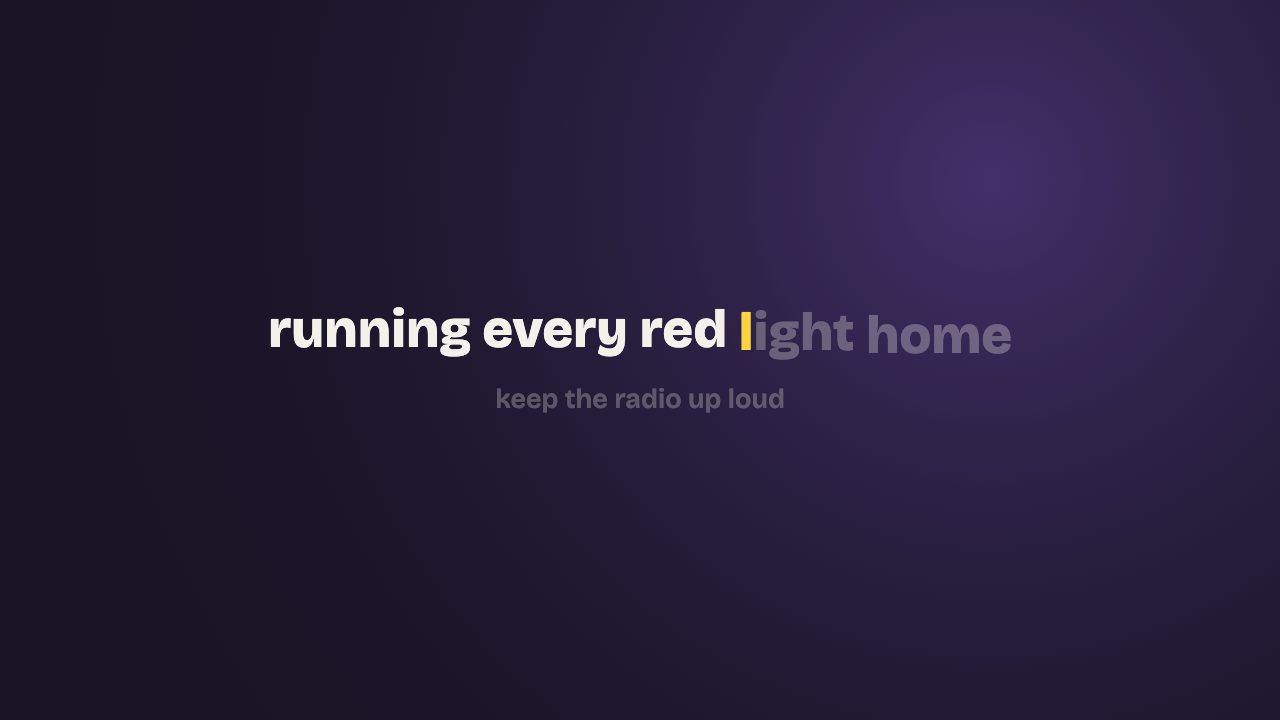
One line on screen. The word being sung fills with your highlight colour, then settles back to white once it's done, and the next line waits faintly underneath so singers can see what's coming. It's the most readable of the four and the one I'd use for worship songs, covers, anime openings and anything people are meant to sing with.
All five animations work here, and they change it more than you'd expect:
- Rise (the default): words wait slightly low and lift into place as they're sung, with the colour wiping across each word. Smooth, good for most songs.
- None: the same colour wipe without the lift. The plainest, most karaoke-machine version.
- Pop: each word jumps in with a small overshoot and lights up all at once instead of wiping. Punchier, suits upbeat pop.
- Glow: the sung word lights up whole with a soft, pulsing glow around it. Nice on slow songs and dark backgrounds.
- Type: letters are typed out as the word is sung, and the next-line preview is hidden. Good for a spoken-word or storytelling feel, worse for singalongs, since nobody can read ahead.
Kinetic: one word at a time
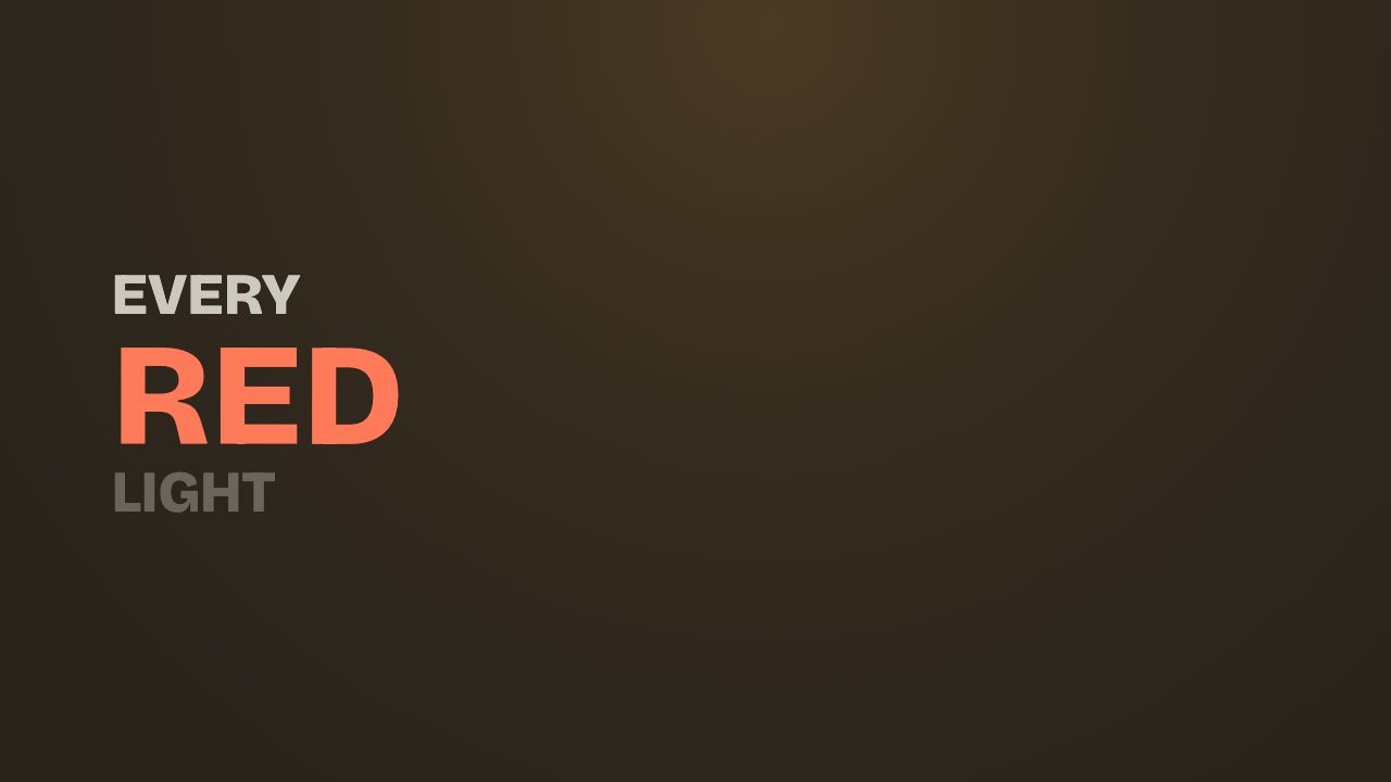
One huge word in caps, punched in with a slight tilt as it's sung. The previous word shrinks up out of the way and the next one waits small underneath. It's loud and rhythmic, so it fits rap, EDM and hooks with short words. It's hard to read on long, wordy lines, because only one word is big at any moment. The kinetic typography page has more on when that trade is worth it.
Animations all work: Rise lifts the word as it lands, Glow adds a halo, None drops the tilt and the scale so the word just appears, and Type writes the word out letter by letter and hides the upcoming word. Pop keeps the punch and drops the lift, since every Kinetic word already scales in with a little overshoot.
Minimal: calm and quiet
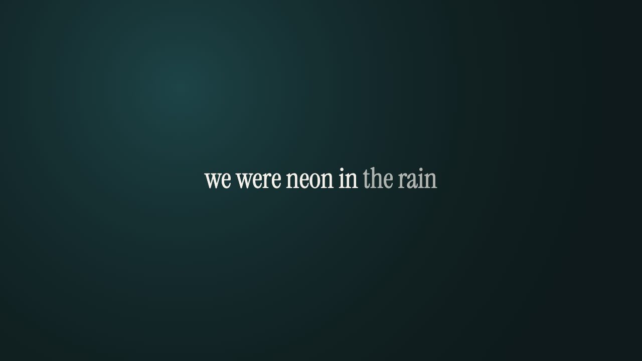
A single serif line fades in and drifts up slightly. Sung words go to full brightness while the rest of the line stays a touch softer. That's the whole effect. Use it for ballads, acoustic tracks, lo-fi and anything where flashy motion would fight the song.
Minimal ignores both the animation setting and the highlight colour. Whatever you pick there, the words stay in your text colour and use the same gentle fade. If you want colour on the sung word, switch to Karaoke. More examples on the minimal style page.
Stack: bold blocks that land word by word
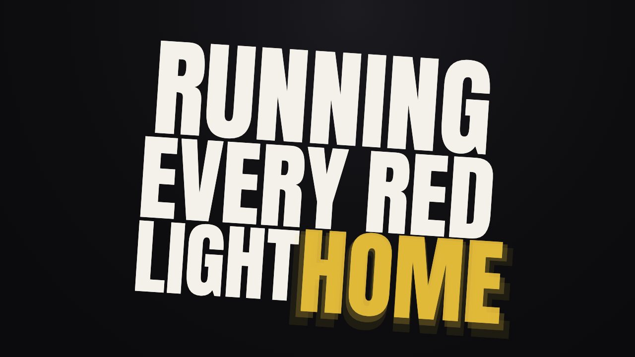
Each line becomes a tilted block of tall condensed capitals. Words drop into the block one by one as they're sung, the word being sung shows in your highlight colour, and when the next line starts the whole block blows up and fades. It's the most dramatic of the four. It works for rock, K-pop fan edits and any chorus you want to hit hard, and it looks especially good in 9:16, where the block fills a phone screen. It's the default on the K-pop style page.
Stack has its own landing motion and ignores the animation setting. It does use the highlight colour. Lines of four to ten words look best; a very long line gets squeezed into a dense block that's hard to read at speed.
Picking a combination
The way I'd do it with a new song:
- Let the timing finish and fix the flagged words first. A great look on wrong lyrics is still wrong.
- Play the busiest verse in Karaoke, then Kinetic. If Kinetic feels frantic, the song has too many words for it.
- If the song is slow, try Minimal before anything else. It's often the right answer for ballads and nobody tries it first.
- Try Stack on the chorus. If the lines are short, it usually wins for vertical clips.
- Only then play with animation and colour. They're the finishing touches, not the decision.
Since the timing is shared across everything, you can export a 16:9 Karaoke version for YouTube and a 9:16 Stack version for Shorts from the same project without redoing anything. The free export is 720p with a small watermark. HD is 1080p without it.
Where a real template is the better choice
If you need a specific typeface for your brand, footage of your band cut on the beat under the lyrics, or a one-off design that matches your album art exactly, an After Effects template or a hand-built edit will get closer than any preset. You'll pay for that in hours of manual syncing. For most releases, a preset look on accurate timing is the faster way to something you'd actually post.